Responsive Menu – Create Mobile-Friendly Menu

Responsive Menu – Create Mobile-Friendly Menu icon
Responsive Menu is a WordPress plugin for creating an attractive and mobile-friendly menu. This plugin helps you create responsive menus quickly and easily, within minutes, without any coding. Plus, it has a live preview mode & is compatible with all major browsers.
What We Think:
90%
Very highly recommended!

Responsive Menu – Create Mobile-Friendly Menu: A Comprehensive Review

The Responsive Menu – Create Mobile-Friendly Menu plugin has become a must-have item for websites aimed at creating a great user experience for visitors accessing their content from mobile devices. Going mobile is no longer an option; with more than half of website traffic now using mobile devices, a website’s easy-to-navigate menu and pictures is more important than ever to its success. Fortunately, the Responsive Menu plugin makes creating a menu for mobile devices easier and cost-effective.

Responsive Menu – Create Mobile-Friendly Menu: Breakdown

Dashboard

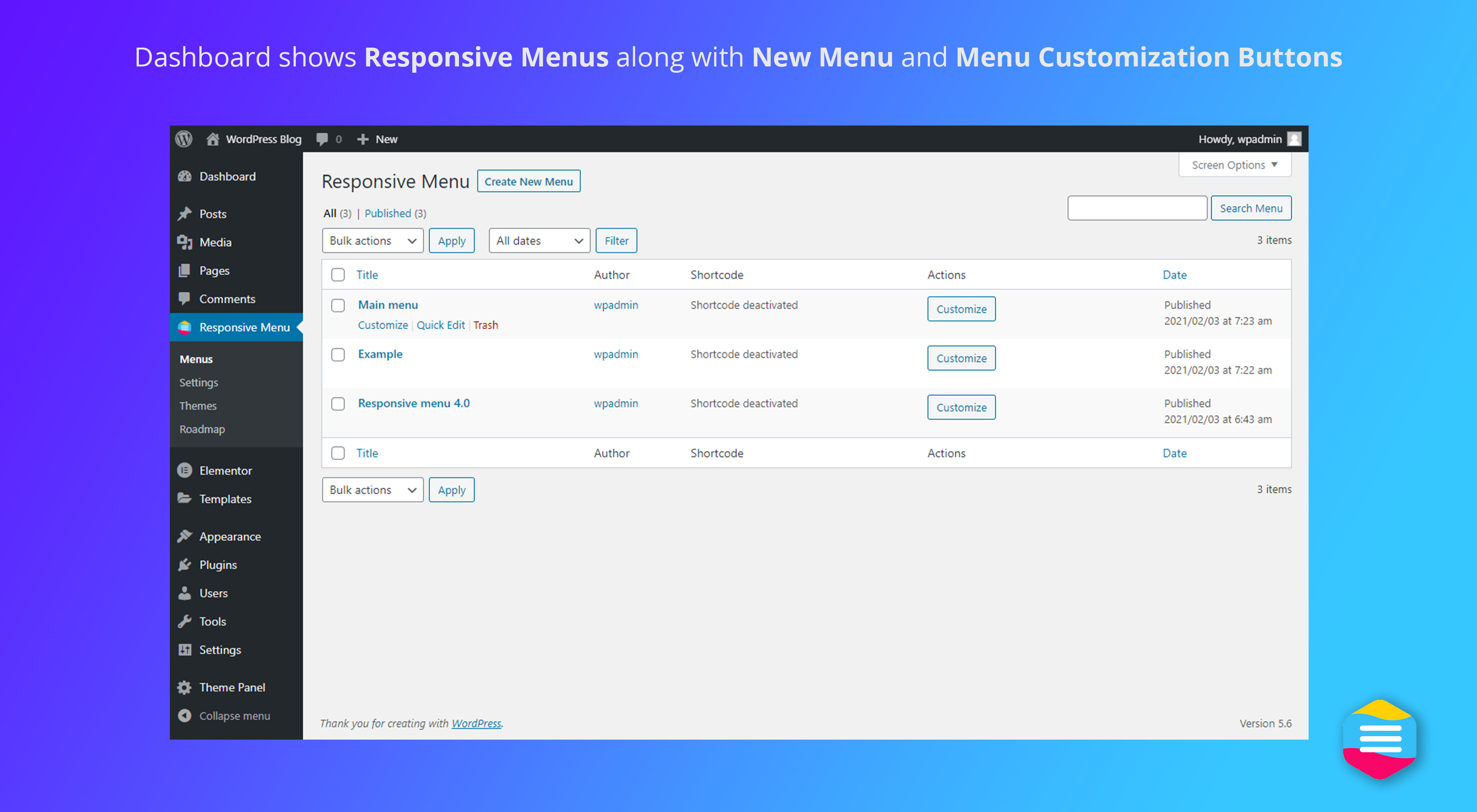
The Responsive Menu plugin is a WordPress plugin that allows you to create a flexible, responsive mobile-friendly menu for your WordPress website. A single plugin gives you complete control over your mobile navigation menu without writing a single line of code. The Responsive Menu plugin has a ton of powerful features to make creating the perfect mobile-friendly menu a breeze.

You can design the menu to match your website’s style and create a completely custom look for the menu. With the Responsive Menu plugin, you can add a logo to the menu, create submenus, showcase images in the menu, and more. You can also set up specific options for different pages to display or not display certain menu items, depending on the page your visitors are viewing.

You can also customize the plugin’s appearance and behavior, including the color, font, and animation. You can also choose to display menus for specific device types, such as tablet and mobile devices, so you can adjust the way the menu looks for different devices.

In addition, the Responsive Menu plugin is search engine friendly, so your menu won’t interfere with SEO efforts. The plugin has built-in search engine friendly redirection capabilities that make sure that search engines like Google don’t get confused while indexing your content.

The Responsive Menu plugin also includes multiple language support, making it easy to create menus for visitors from different languages and countries. All menus can be exported to XML format, allowing you to easily transfer the menus to other websites and platforms.

Finally, the Responsive Menu plugin is completely free and easy to install, and regular updates keep the plugin running smoothly.

Pros of Using Responsive Menu – Create Mobile-Friendly Menu

Easy to Use: Responsive Menu - Create Mobile-Friendly Menu WordPress plugin makes it easy to set-up a mobile friendly menu in a flash, eliminating the need to code. The intuitive user interface allows website creators to create a menu with all the best features, including drop-down menus for multiple levels of content, beautifully designed icons and images, and varying ways to customize the look and feel of the menu. This plugin also makes it easier to optimize navigation for smaller screens.

Customizable: The plugin allows for plenty of customization options to create the perfect mobile menu for any website. It’s easy to personalize the look and feel of a menu with custom colors, icons, and text. Plus, users have complete control over font sizes, font weights, padding and margins. And with optional animation features, menus can be jazzed up even further.

SEO Optimized: The plugin is designed to be SEO friendly, giving website owners the ability to add SEO-optimized meta descriptions to each menu item. This allows for crawlers to read and index every item in the menu. Additionally, search engine-friendly code allows the plugin to be tracked by popular search engine optimization algorithms like Google’s PageRank.

Multi-Language: The responsive menu plugin is multi-language compatible, allowing for translations into multiple languages and content to respond to visitors from different countries and regions. This allows websites to offer a truly global presence and larger online reach.

Compatibility: The plugin is also compatible with various page builders and themes, ensuring the menu is always displayed properly. Additionally, the plugin handles keyboard navigation seamlessly, ensuring the best user experience possible.

Cons of Using Responsive Menu – Create Mobile-Friendly Menu

Too Complicated to Set Up: The Responsive Menu – Create Mobile-Friendly Menu plugin is incredibly powerful, which can be a downside. Setting up the plugin can be quite complicated and confusing, especially for novice users. Users need to configure several settings, such as colour schemes, menu orientation, and more, to make sure the plugin functions properly. This can be a time consuming and daunting task.

Not Compatible with All Themes: The Responsive Menu – Create Mobile-Friendly Menu plugin is only compatible with certain themes. It is not always possible to install and use the plugin on every theme out there due to compatibility issues. This means users will need to use the themes that are suggested by the plugin in order to get the full benefit from this plugin.

High Memory Consumption: The Responsive Menu – Create Mobile-Friendly Menu plugin is a powerful plugin and as such, can consume a lot of memory on your server. For this reason, users need to ensure their server can handle the plugin's high memory consumption in order to make sure it functions correctly.

No Support for Older Browsers: The Responsive Menu – Create Mobile-Friendly Menu plugin does not support older web browsers. This means users may not be able to access certain features or experience the same performance level when using older browsers.

Buggy and Unstable: The Responsive Menu – Create Mobile-Friendly Menu plugin can be quite buggy and unstable at times. Although the plugin is updated regularly, users may encounter issues with the plugin, such as crashing and not functioning as expected. This can be a nuisance for users and can become a time consuming problem to fix.

90% Very highly recommended!

In conclusion

The Responsive Menu plugin provides the necessary tools to create great looking mobile-friendly menus on your WordPress website. It makes it easier to create a great user experience for visitors from a range of different devices, without having to write a line of code. The plugin also includes SEO friendly redirects, multiple language support, and options to export your menu into XML format. Best of all, the plugin is free and easy to install, so there’s no need to break the bank or spend time learning complex coding techniques.

Plugin Specifications
  • Version: 4.3.2
  • Last Updated: 6 months ago
  • Installs: 100,000+
  • WP Version: 3.6+
  • Tested Until: 6.4.2
  • PHP Version: 5.6 or higher
Use Case Examples
  • Creating mobile-friendly menus for personal blogs
    Close
    Responsive Menu – Create Mobile-Friendly Menu is a WP plugin that allows for bloggers to easily create intuitive mobile menus for their sites and blogs. This plugin makes it easier for users to navigate through the site on a mobile device and access individual posts, pages, category and tag pages, and more. It also automatically resizes menus and optimizes for different device sizes, making sure that all users have a good experience no matter the device being used to view the site.
  • Enabling seamless functionality for landing pages
    Expand
  • Creating mobile specific menus for e-commerce stores
    Expand
  • Improving user experience in mobile-app based websites
    Expand
  • Making websites accessible to visually impaired people
    Expand
Tags
  • hamburger
  • mega menu
  • mobile
  • navigation
  • responsive