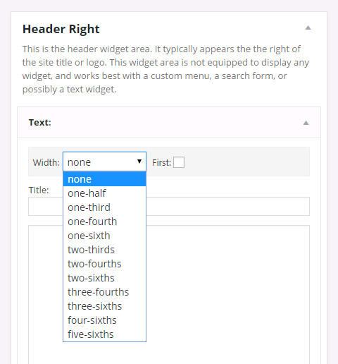
Genesis Widget Column Classes: Breakdown

The Genesis Widget Column Classes plugin provides users with a range of options to control the layout and presentation of their widget areas. One of the main features of the plugin is the ability to add custom column classes to individual widgets. This means that users can easily create multi-column layouts within their widget areas without having to write any code.
By simply selecting the desired column class from a dropdown menu in the widget settings, users can designate whether a widget should have a full-width layout or be divided into multiple columns. This level of customization allows website owners to create visually appealing and organized layouts that suit their specific needs and design preferences.
Furthermore, the Genesis Widget Column Classes plugin offers additional flexibility through its support for custom CSS classes. Users have the option to define their own CSS classes, which can then be applied to individual widgets or widget areas. This opens up a whole new world of possibilities for design customization, ensuring that users can achieve a truly unique aesthetic for their websites.
In addition to its customization features, the Genesis Widget Column Classes plugin also improves the overall functionality of widget areas. It introduces a new widget area called "Flexible Widgets," which allows users to create responsive layouts that adapt to different screen sizes. This is particularly useful for ensuring a seamless user experience across devices, as it allows content to be rearranged and resized dynamically.
Furthermore, the "Flexible Widgets" feature enables users to display different sets of widgets on different devices, adding an extra layer of adaptability to their websites. Whether it's showing a three-column layout on desktops, a two-column layout on tablets, and a single-column layout on mobile devices, the plugin ensures that the content is optimized for each device.